The Svensson Taster (Svenssonsmakaren, which perhaps should translate to the John Doe Taster) is the strange name of a wine blog written by David Lindén. It is in true traditional “blogging spirit”, short (sometimes) and personal stories about what David drunk and sometimes ate. David has also at one point written a guest article here on BKWine Magazine.
But what really distinguishes The Svensson Taster blog from other wine blogs are the photographs. Virtually without exception fantastic pictures. Even though almost all the images are of “simple” and mundane things like wine bottles and glasses. (Purely photo technically it is actually quite difficult things to photograph.)
(Dare I admit that I visit the blog most often to look at the pictures and not for reading? Not that there is anything wrong with the texts! They are absolutely worth reading, too!)
There are few other wine blogs that even come close to the picture quality that David regularly shows on The Svensson Taster blog.
Even most wine magazines would have something to learn. I think that probably none of the Swedish wine magazines (and few in other countries) have bottle pictures and glass images which regularly keeps such a high quality that David does.
David is not at all a (professional) photographer. I think he is a teacher. (?) But if he someday gets tired of screaming kids and test correction then there is probably another career to think about.
I asked David if he wanted to make a new guest article on BKWine Magazine, but this time only with pictures. And suddenly one day a mail with nine pictures landed in my inbox.
Here they come.
I thought it might be fun to give some of my own personal comments to the pictures too… Please indulge me.
Bonus: Ten Photography Tips for Better Pictures
And last of all, at the end of the article, after David’s pictures, a list of ten things to consider in order to make better (wine) pictures. Not that David needed them, but they might be of use to someone else.
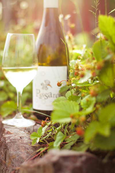
The very pale / bright light in the picture is risky but works well. Summer feeling, especially with the wild strawberries, a little dreamy. And a well-planned light reflection in the glass.
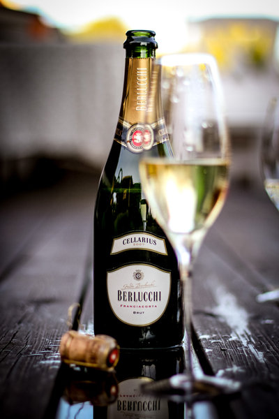
Perfectly planned puddle to get reflex. A ray of sun in the glass and in the sky. But still enough light on the bottle. (Glass #2 on the right is perhaps unnecessary. Or could have been a bit more in the frame?)
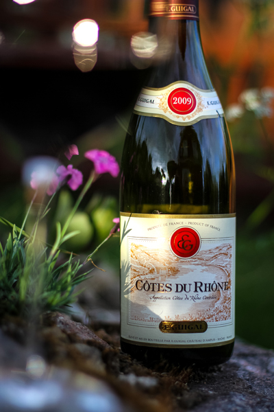
Summery. Successful balance between the sun rays and the shadow areas on the bottle. It is easy to get too much contrast but here it works. Added mood with a small un-sharp blob in the foreground and a bit of background bokeh.
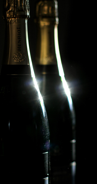
Here it is (obviously) not so much the wine in bottle (or the label) that is important. Beautiful silhouette and successful reflexes.
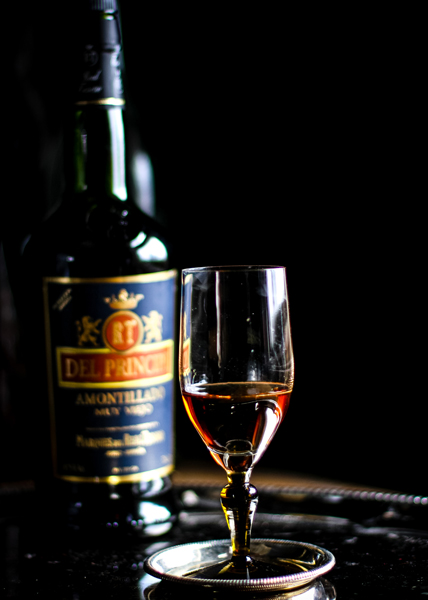
One certainly longs for a glass of sherry! Great props to give an “old-fashioned” atmosphere. (Although I would love to get rid of the old-fashioned stamp on sherry.) Sharpness and brilliance in the glass and a slight blur on the bottle (un-sharpness is important), but no more than that you can still read. And perfect reflections in the glass. Try for yourself to get a wine glass to look like that and you will see how easy it is.
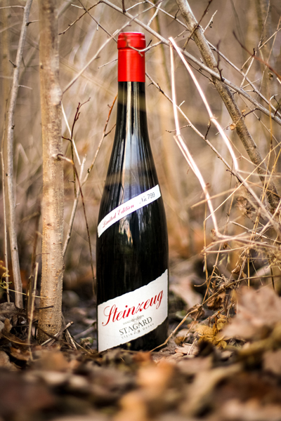
Perhaps a little strange a picture. But it does show the importance of being down to earth as a photographer. One must be prepared to crawl on the ground!
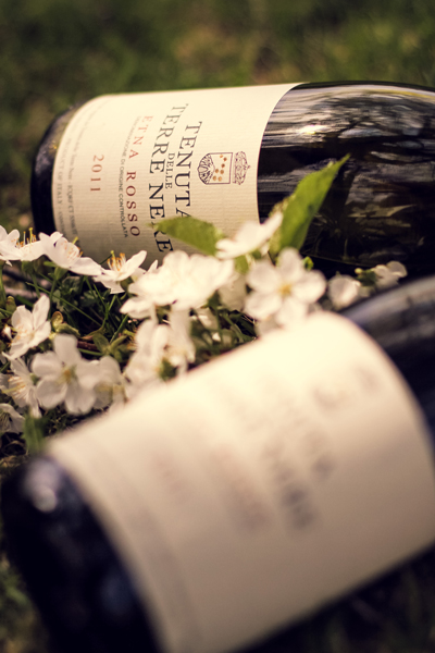
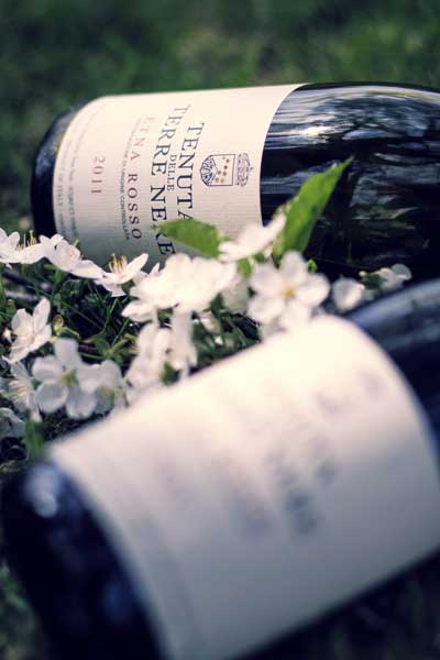
The composition of the two bottles work well I think. Though I probably would personally like to tone down the yellow in the picture a bit and get the light a little bit more neutral.
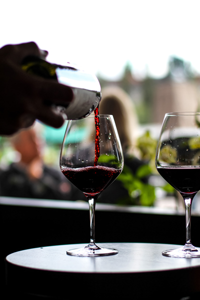
You simply have to sit at just the right angle and to be prepared the second when it happens to get the light reflected in the falling wine. That is what makes the difference between an ordinary glass picture and an exciting glass picture. But I would have been even happier with the glass not bang in the middle of the picture. Perfect timing. Plus a really successful background.
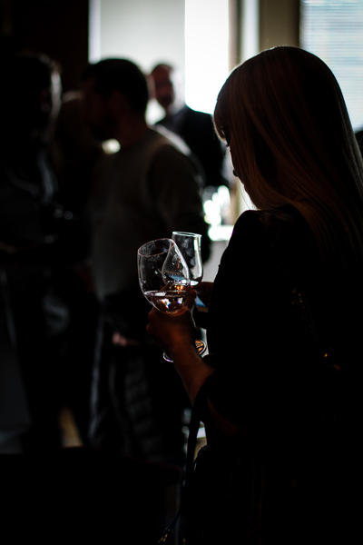
Again a silhouette and a picture where everything depends on a small light reflection in a glass. Without the light in the glasses so it had not been as exciting. I would have liked to have it cropped a bit tighter. Just a suggestion… ;-) (And then you would not get the glasses right in the middle of the picture.)
If you want to see more of David Lindén’s photography, or why not read his articles (if you read Swedish), head over to The Svensson Taster’s wine blog.
Many of the pictures are as if pulled from a glossy food or wine magazine.
Ten Photography Tips
So, some tips on what to think of to make better photos:
1. Do not use flash!
Rule number 1! Flash lightning is guaranteed to destroy most of the qualities of the image. (How many food blogger pictures have you not seen with the flash straight on, where the food looks almost repulsive?…)
2. Think of the light!
It is perhaps the most important point of all. It is the light that makes the picture. This is illustrated quite superbly by David’s pictures above. There can be many different kinds of light that makes good pictures. However, always think of the way it is.
3. Keep the camera still!
Also a common blogger problem. The whole image is blurry because you did not hold the camera (phone?) still.
4. Consider the composition! (1)
Where do you put the main subject in the picture? In the middle of the picture? Works great sometimes, but usually not. See e.g. the last example. Works in my opinion better with the important thing (the glasses) to one side. See also the so-called Rule of Two Thirds.
5. Consider the composition! (2)
Simplify, simplify, simplify. It often works. It’s easy to try to include too much in the picture. It is usually better to make it simpler and cleaner instead.
6. Be careful with white balance!
Now it gets a bit technical. The white balance has to do with the colour of light. Incandescent light bulbs give a yellow light. Clear blue skies have … a blue light and so on. Indoor photo often gets a yellow cast in the picture because the photographer does not think of correcting / adjusting the white balance. (See for example Terre Nere above and compare it with a version with a different white balance below.) Many cameras (and phones) does a decent enough job of automatically adjusting the white balance today, but not always.
7. Think of sharpness and blur!
This too is excellently illustrated in several of David’s images. Think of what should be sharp in the image and use blur (un-sharpness) to give an additional dimension. However, it can be difficult to do this with a phone camera as they tend to make pretty much the entire image sharp. Take a look at the pictures above. Almost all the images use in one way or another un-sharpness very effectively.
8. Get closer!
Often you tend to keep too big a distance to the subject, especially if it is a person. Move closer. Often it will be better (plus you will get rid of unessential “rubbish” in the margins).
9. Be careful with the exposure!
Make sure that that the image is not too dark or too light. In most images the light should be “just right.” But it may work excellently with very bright (overexposed) or dark (underexposed) photos too. David’s pictures show examples of all three versions!
10. Watch and think!
When you see a picture you like, think about why you like it! What is it that makes it special and better than others? Then try and do something similar yourself!
Thank you David!





One Response
Thanks for the tips…and the great examples. Very nice work.